If your website wasn't designed or redesigned in the last few years, most likely it won't look good on mobile devices and may not even be usable on mobile devices. Recently, comScore reported to the Canadian Press that 49% of internet usage in Canada is performed on a mobile device. You may want to check your site today because your business may be missing out on website traffic.
Tools to check your site
There are many tools on the internet to check and find out what your site looks like on many different mobile devices and screen sizes. Of course you can check using your own mobile devices but your devices will not cover all the different devices and sizes available to consumers today.
One very simple tool we found is called ScreenFly from quirktools.com. This free tool enables you to enter the website address of your site and change screen sizes to view your site at different sizes. The sizes are linked to device names, such as the iPad, iPhone, etc… so you can see the different devices. The Screenfly tool is really quite good for a quick look although it is not an emulator so some functionality on your website being viewed may not work as it does on a mobile device. You would need a device emulator to perform such functionality testing.
What to look for when checking your site
When you check out your site using Screenfly if you notice your site content doesn’t move when the screen size selection has changed, then you most likely have some work to do. If your content does change to fit the screen then most likely you have either and adaptive or responsive website design.
Adaptive and Responsive designs
An adaptive website design is a design which is built with several different screen sizes already set. When the person on the mobile device goes to your website the screen size will be looked up and the content will be adapted to fit in the screen.
A responsive design uses some techniques to again identify screen size but then the content is resized to fit on the device screen and the flow of content is different. On smaller screen mobile devices, usually the menu is reduced to a button, which when pressed, shows the entire menu as a dropdown screen. Also on smaller mobile devices screens, pictures are usually resized to fit and content is arranged in a vertical flow so the user can easily swipe down through your content.
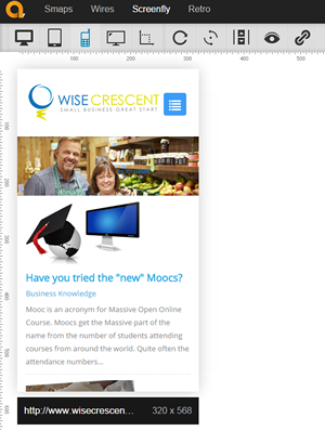
The following picture shows Wise Crescent using the size of an iPhone5. Notice change of the menu to a dropdown button. Also, the main picture has been resized and the quotes from the home page have been moved down on the screen under the story content.
The common path for design
Responsive designs are becoming common place as the designers can easily control how they want the content to look. These designs usually flow quite nicely on mobile devices and provide a good user experience to the mobile device user.
If you need help with redesigning your site or creating your site with a responsive template, Wise Crescent can help. Simply touch base with us today.